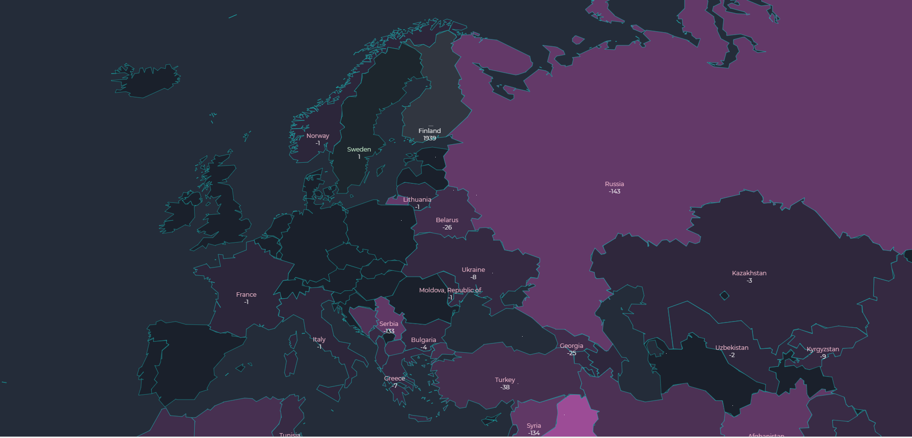
This project started with a hunch that visualising each refugee as one moving dot on a map could be a powerful way to convey the magnitude of the crisis. After building a quick proof-of-concept, we recognised that such a visualisation does not only show the scale of the numbers, but also beautifully tells the story of what those numbers mean.
The core of the project is an open source interactive map that shows asylum applicants arriving in European countries — one that lets the viewer observe change over time, and dig deeper into the places and moments that surprise them.
The secondary goal of this project is to experiment with the concept of embeddable interactive data visualisations for journalism. The project has been embedded in around 50 international news sites in more than 20 countries, including The Independent (UK), The Atlantic (US), National Review (UK) and Daily Mail (UK). The Daily Mail is the world's largest online newspaper when measured by monthly unique visitors. Around 75% of our viewers have come from sources that have embedded the visualisation in their site.
In the future, we plan to open source the code we used for wrapping this visualisation as embeddable components. It is now pretty well tested!
We also believe that the technique for visualising flows can be adapted to many other contexts. Systems thinkers like Donella H. Meadows believe that all dynamic systems are best understood as a combination of stocks and flows. Open sourcing the solution helps others to build on this idea and our work. Overall we wish to improve interactive data visualisation for journalism by facilitating reuse and collaboration.